Fall 2024 · UX Researcher & Designer
Redesigning chatbot answers so buyers found what they needed in 40%+ less time
UX DesignB2BChatbot
What I'm proud of
I look at how an answer is shown, not only at what it says.
- Context
The chatbot on Salesforce's website answered in long paragraphs, with limited options and repeated pushes to sales, and many visitors abandoned it.
- Insight
People scrolled back and forth to reread answers, left as soon as sales came up, and needed something to share with the other buyers at their company.
- Result
New chat components on the Salesforce Lightning Design System (SLDS), and 40%+ less time to find information in observed testing.
What we delivered
A redesigned chat with answers people can click, compare, and share.
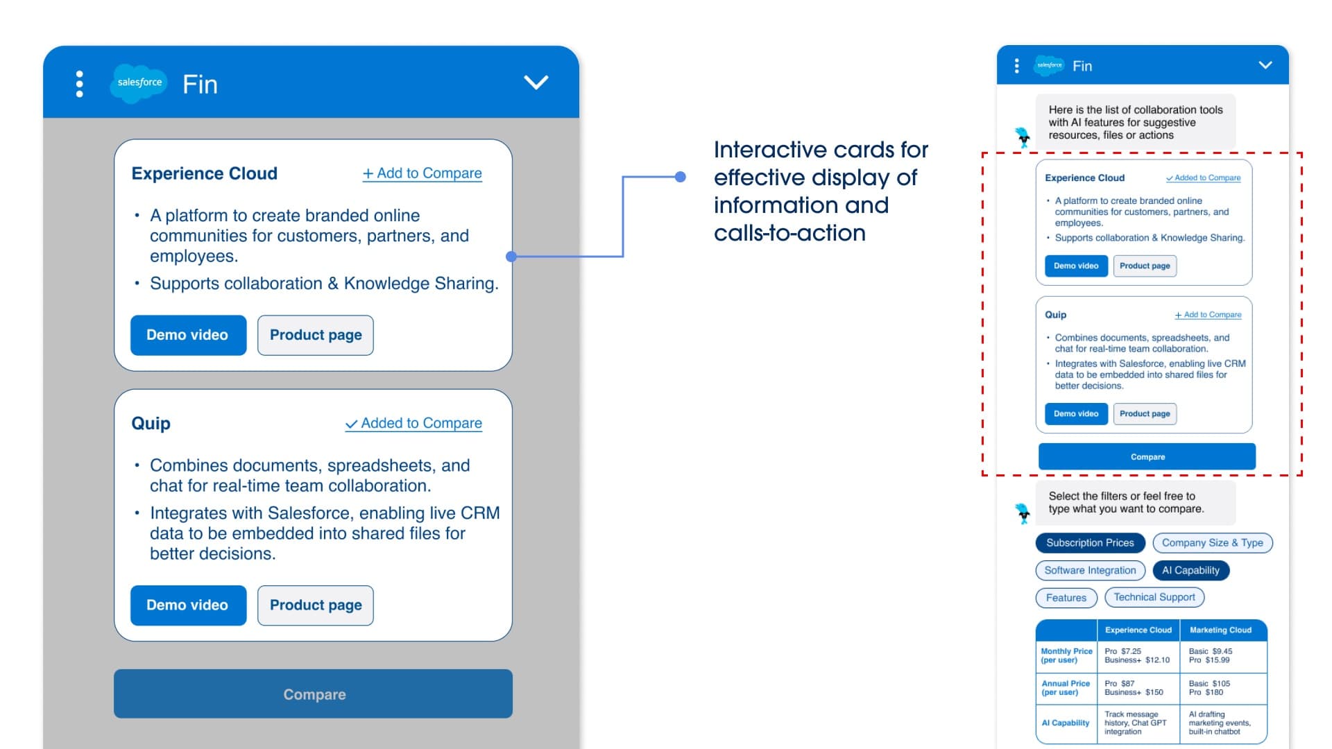
Product cards
A visual and 6 to 7 key facts, sized so several products fit in one view of the chat window.
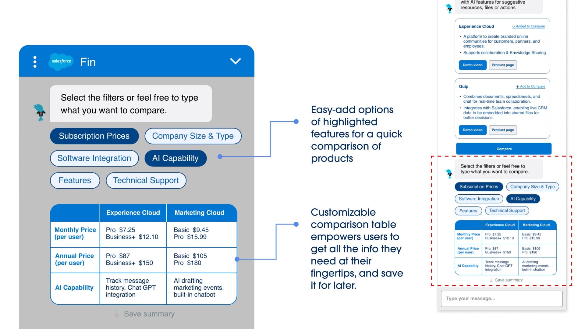
Compare and download
Products side by side, starred into a collection, and downloaded as a comparison to share with the team.
Clarifying questions
One at a time with quick-select answers, so the chatbot gets context without stopping the conversation.
How I got there
Salesforce's website chatbot answered in long paragraphs and pushed to sales too early.
Salesforce's website has a chatbot to help business buyers explore its products and decide whether to talk to a sales rep. Every answer was a long paragraph with no hierarchy, limited options, and a repeated push to sales. In the small chat window, one answer took several scrolls to read, and with no way to export the conversation, the chat was hard to share. Abandonment of the chatbot was high.
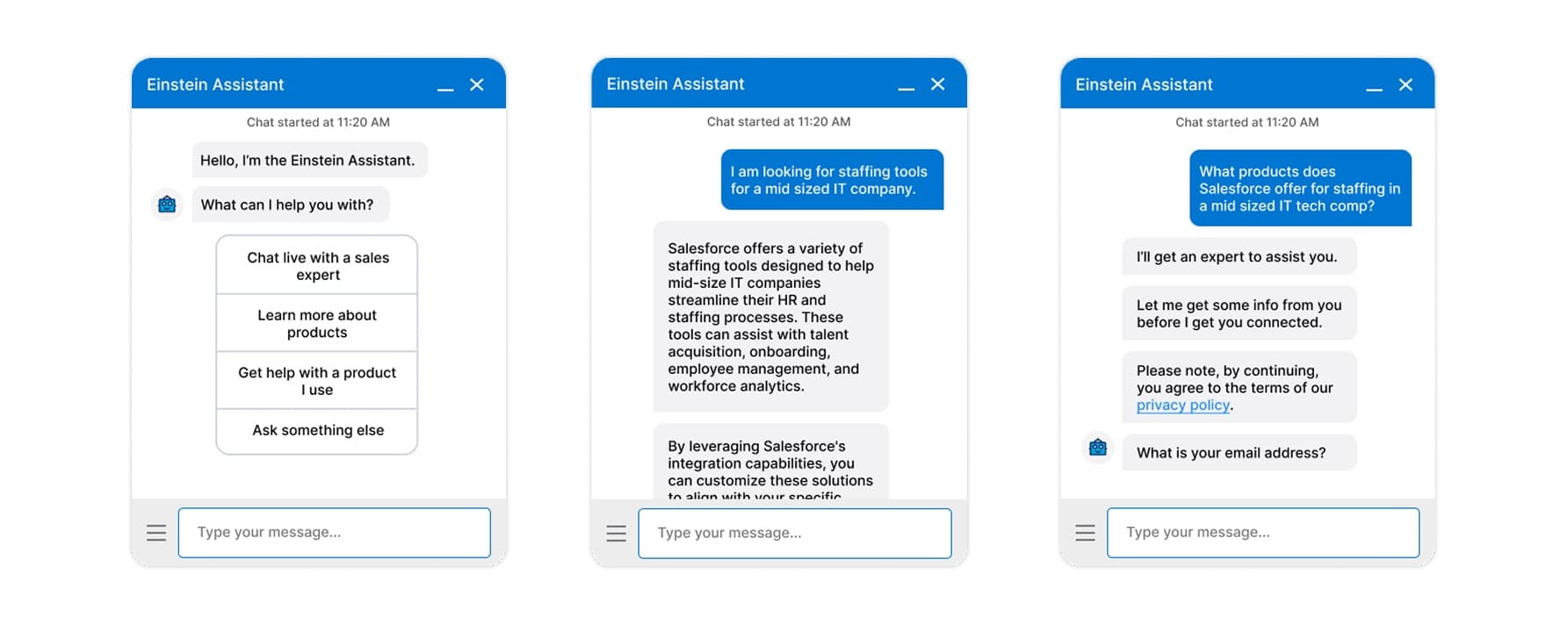
People scrolled back and forth, left when sales came up, and had to take answers back to their team.
We ran 15+ contextual inquiries with people using the chatbot. Three findings shaped everything that followed.
What our research showed
Participants scrolled up and down to refer back to what they asked, what the answer was, and what each block of text said.
They abandoned the chatbot as soon as it mentioned sales. It came too early, before they had made a decision.
B2B buyers take what they learn back to their company. Several people are involved in a purchase, and the person deciding may not be the one exploring the tools.
Key decision
The first problem was long answers, so we turned them into cards that fit in one view.
Because people kept scrolling back and forth, product cards replaced paragraphs: a visual plus 6 to 7 key facts, sized so several fit in the chat window at a glance. A compare option puts products side by side, and buyers can star products into a collection and download a comparison (names, pricing, specialties) to share with the rest of their team. We built the cards on the Salesforce Lightning Design System (SLDS), reusing familiar e-commerce patterns instead of inventing new ones.
The second problem was irrelevant answers, so we first tried a short form.
To combat irrelevant responses, we introduced a form with deterministic answers, like company size and industry, that would give the chatbot's LLM more context. I liked the idea at first too. Initial testing, where one subteam tried what the other had built, ruled it out. In the small window, the form needed horizontal scrolling inside a vertical scroll, and the feedback was that this pattern usually leads to confusion, missed information, or misclicks. It also wasn't feasible: each Salesforce product would need its own long list of questions.
The first version: the intake form we tested, before it was dropped.
Key decision
We dropped the form, and the chatbot now asks one question at a time.
Instead of a form up front, the chatbot asks clarifying questions one at a time, with quick-select answers. It still gets the context it needs, like company size and industry, without stopping the conversation.
Links to product pages now keep the chat open and highlight the answer.
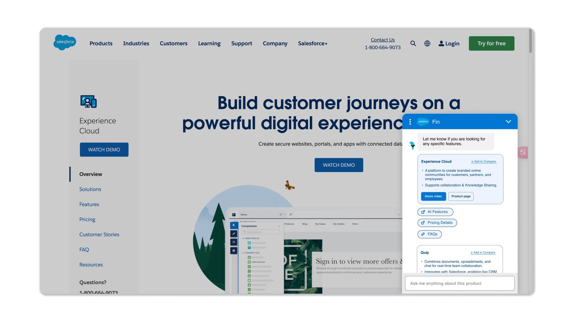
The original chatbot gave no links. Salesforce's experts told us why: links usually opened a new tab, and they were afraid engagement in the chat would drop. So when the chatbot refers to a page and quotes from it, the page opens with that section highlighted and scrolled into view, and the chat stays open on the new page, not only the old one. Links also got icons that show where they lead, and the close (×) icon became a minimize arrow. Two usability heuristics at work: visibility of system status, and match between the system and the real world (Nielsen Norman Group).
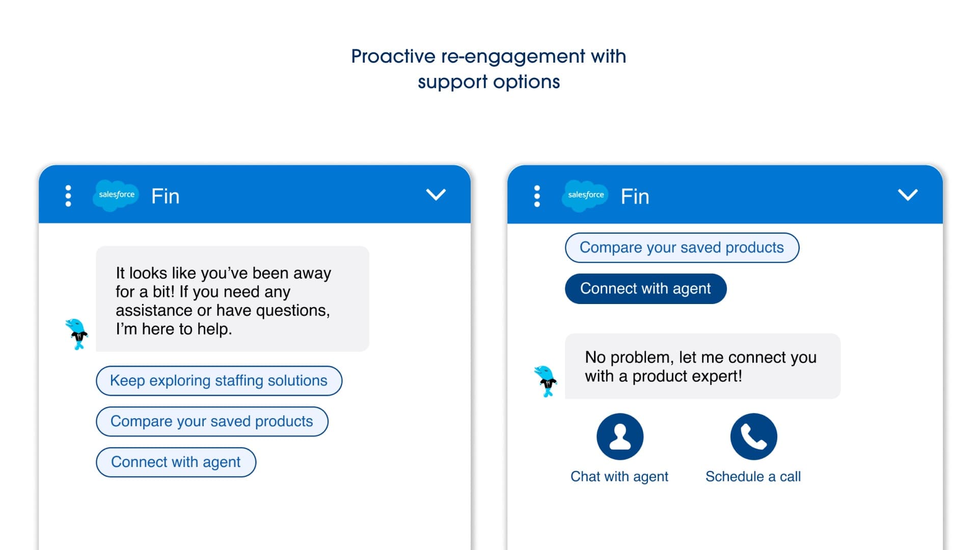
Visitors who go quiet get three suggested questions, and engaged visitors get the option of a sales rep.
If a visitor goes idle, the chatbot offers three custom prompts drawn from the conversation so far: never more, never generic, and never too often (our sponsor asked us to re-engage without nagging). Instead of pushing a sales rep from the first message, the chatbot offers to connect a visitor with a sales rep only after sustained interest in one topic, with one tap to call or copy the number.
Inactivity prompt: three suggested questions based on the current conversation.
After the redesign, people found what they needed in 40%+ less time.
Abandonment was the problem we started from, but we couldn't deploy the redesign and test it in the live environment. Our hypothesis: if browsing effort went down, people would be more likely to keep going. So we tested that in observed sessions. Participants ran the same scripted conversation on two similarly complex products, Sales Cloud and Marketing Cloud, one on the live chatbot and one on our prototype, and we switched the order so the product itself wasn't making the difference. Comprehension stayed the same, and the time to find all the information they needed dropped 40%+. The component-based design also scored higher on engagement, information retention, and satisfaction.*
*Usability testing from an academic project, not a production launch.
What I'm proud of
I look at how an answer is shown, not only at what it says.
The chatbot's answers were accurate, but they arrived as long paragraphs in a small window, so people scrolled back and forth to find them again. We turned answers into product cards, comparisons, and clarifying questions built on Salesforce's own design system, and testers found all the information they needed in 40%+ less time, with the same understanding at the end.
If I had another chance, I'd redesign the chat window as well.
We designed what goes inside the chat window, but kept the window itself as it was. Its shape, size, position, and micro-interactions affect how people read an answer as much as the components inside it do, so I'd design the window along with what goes in it.