Fin: Designing Trust into Salesforce's B2B Chatbot
Traced why a B2B chatbot's users didn't trust its answers back to a single root cause — opacity — then rebuilt both what the bot said and when it stepped aside for a human, so a handoff to sales meant something instead of happening by default.
- Role
- Product & Research Lead
- Timeframe
- Academic project · Salesforce-sponsored · Team of 9
- Focus
- Conversational AI · Trust & Safety · B2B
The chatbot's only job was to move a buyer toward purchase — but it handed off to a human the same way whether the buyer had shown intent or not.
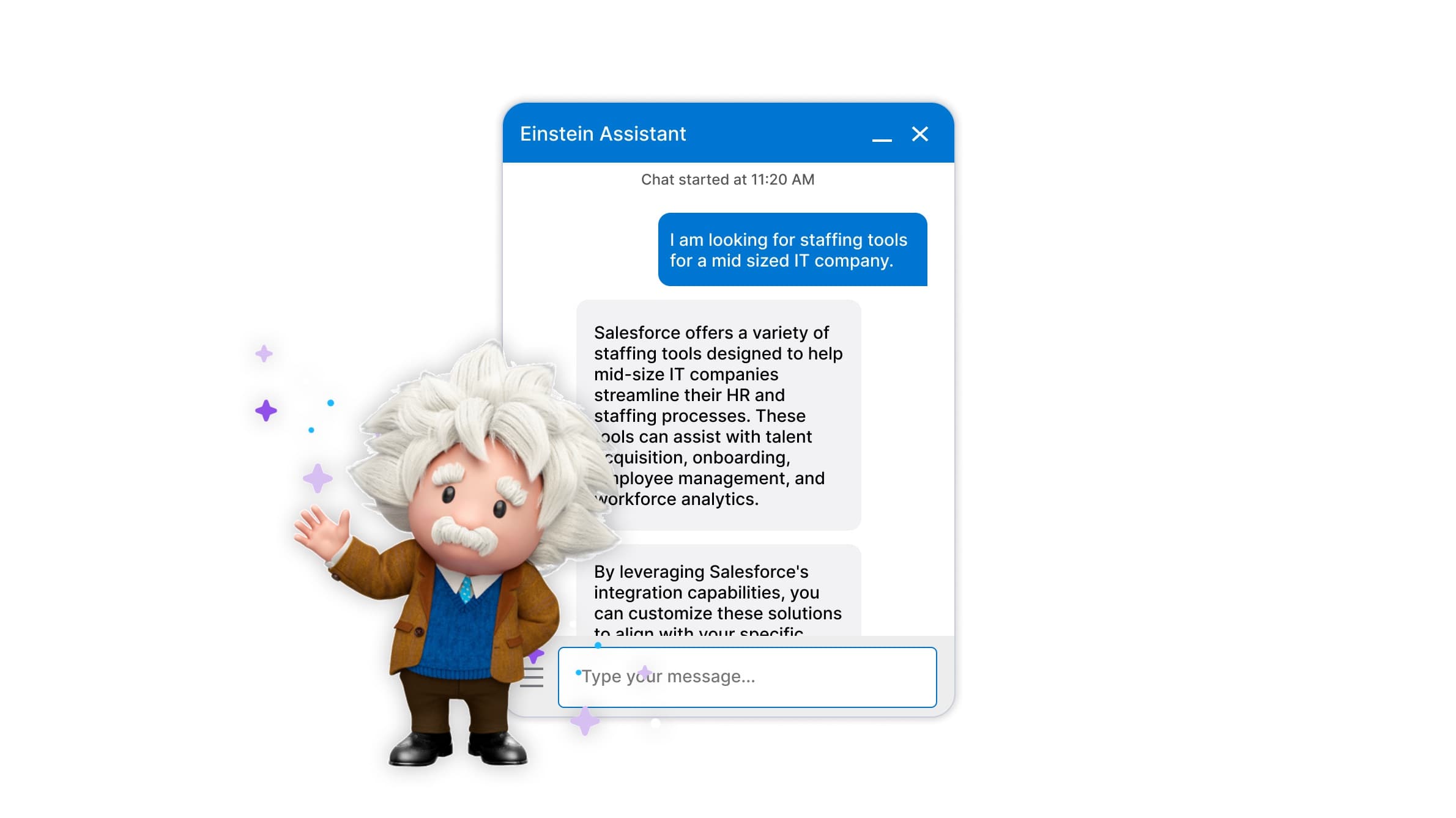
An academic project sponsored by Salesforce, on a 9-person agile team, at a moment when chatbot interaction patterns in B2B software were still new and largely unestablished — there wasn't a proven playbook to build on. Every conversation defaulted to a human sales agent regardless of buyer intent, which meant Salesforce was staffing more live agents than the resulting conversations actually converted.
Users didn't distrust the bot's answers because they were wrong — they distrusted them because the bot was performing helpfulness instead of being useful.
Discovery research surfaced trust — not raw functionality — as the core barrier to users accepting AI-generated responses. In practice, that opacity had a shape: the bot pushed toward sales before it had demonstrated any value, gave answers too long and repetitive for a chat window someone's skimming on the side of a screen, and behaved identically from the first message to the last, regardless of how engaged the user actually was. Users didn't dig in to find out more — they closed the window.
Few existing interaction-pattern conventions to build on — this was early, foundational work
9-person agile team, requiring the roadmap to be broken into buildable increments
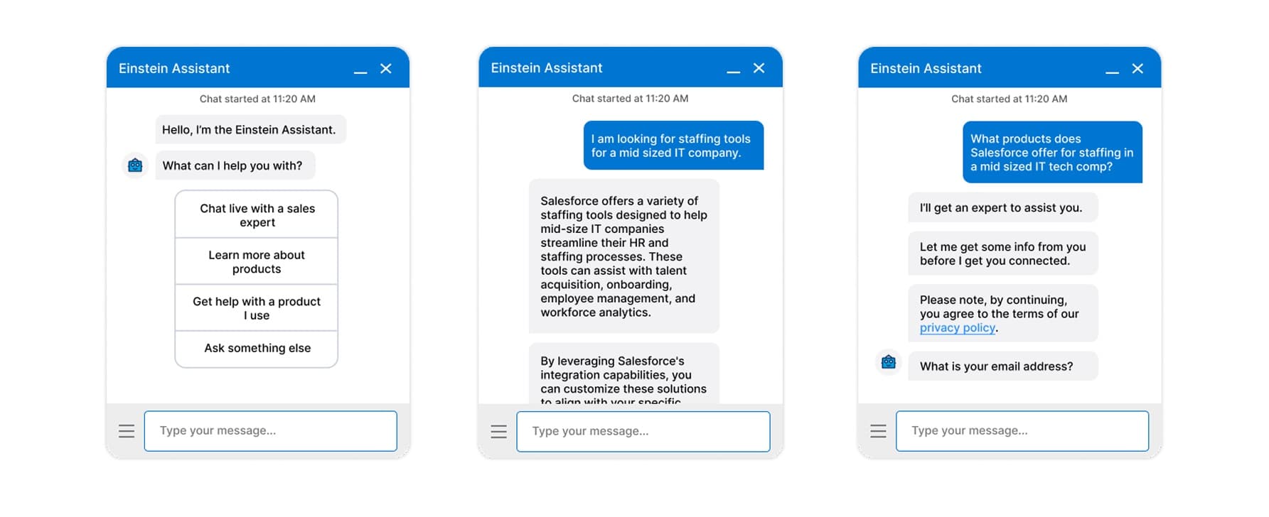
I traced the trust problem through 15+ conversations, then rebuilt the reply itself, one design decision at a time.
Fifteen-plus contextual inquiries — including with people who'd actually bought B2B software — traced the trust problem to a workflow the bot never accounted for
Led discovery research synthesizing 15+ contextual inquiries into user needs, frustrations, and success metrics. The interviews that mattered most were with people who'd been part of securing new software at their own companies: buying wasn't a single decision, it involved internal deliberation, comparison reports, and summaries built to justify a tool to the rest of the team. The bot had been designed for one person in the moment — not someone who'd need to take what they learned back to a team for approval.
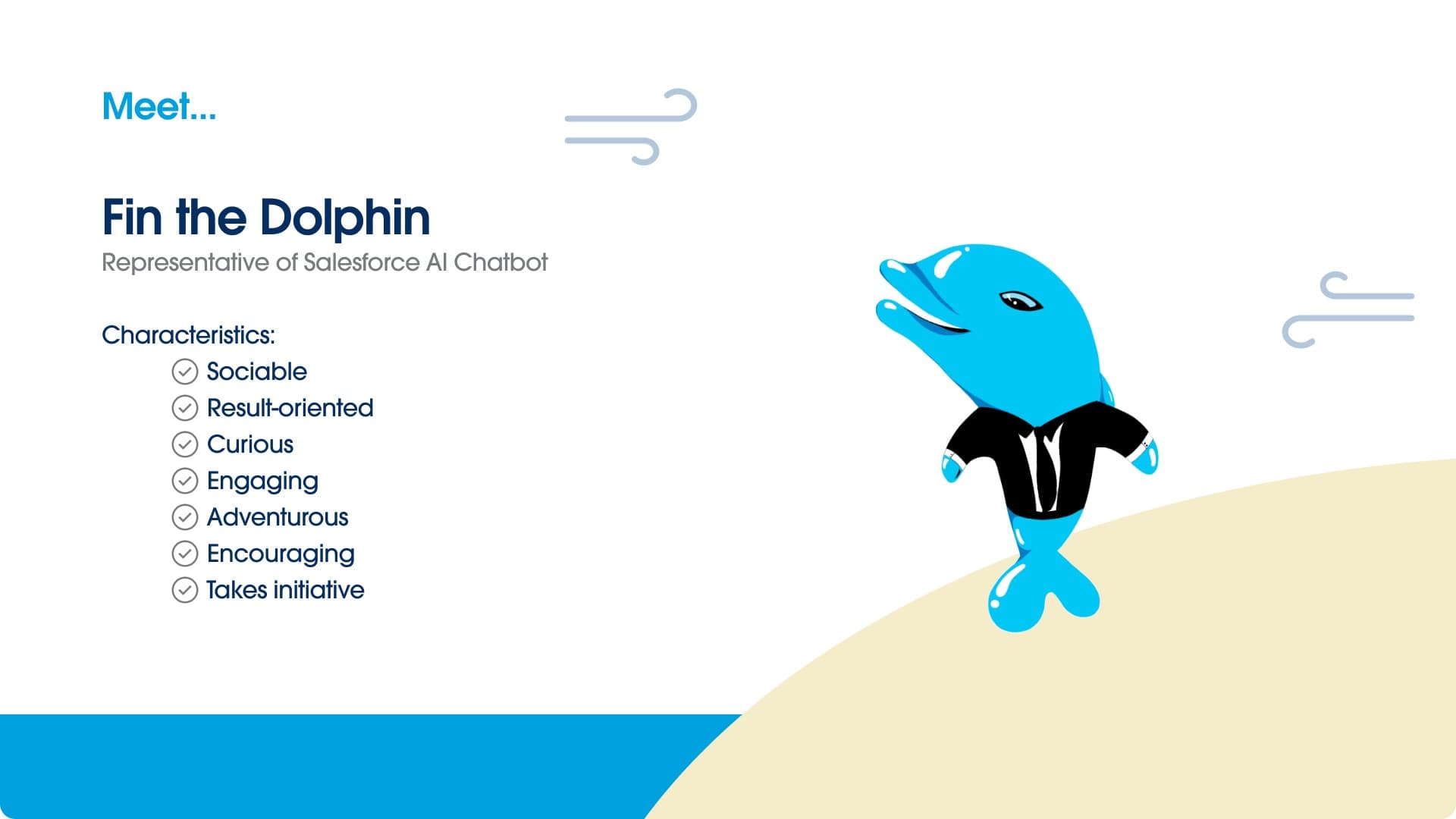
Transparency turned out to be a question of tone, not just content — so we tested a personality rate instead of picking one voice
Research into B2B communication showed warm, friendly language wasn't always welcome in a professional buying context — data mattered more than pleasantries. But a purely data-first version tested just as badly: high drop-off, because it read like website copy pasted into a chat window, disconnected from what the person had actually asked. Testing landed on a tunable personality rate rather than a fixed tone, run across multiple AI persona profiles that testers could log into and compare.
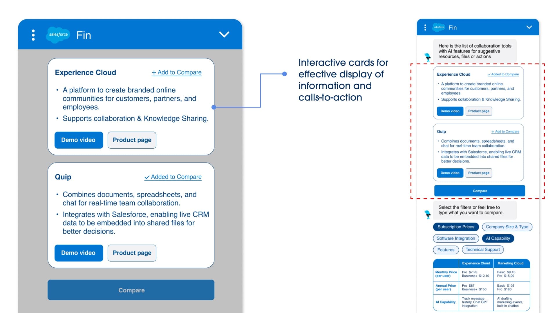
Designed high-fidelity prototypes, on the Salesforce Lightning Design System, that showed their work instead of just their answer
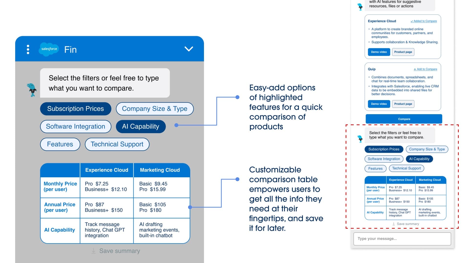
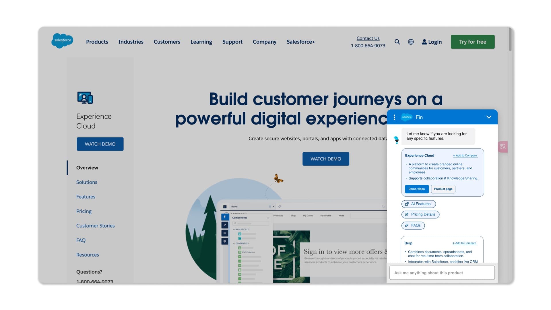
Transparency became concrete: a product card carrying a visual and 6–7 data points, sized to fit a single scroll, replaced long paragraph answers. Users could save and star products to a running collection and generate a downloadable summary — pricing, names, specialties — built for sharing with coworkers, the same artifact the interviews showed buyers were already assembling by hand. Where a card couldn't hold the full answer, the bot linked out to the real product page with the exact paragraph that answered the question highlighted, keeping the thread transparent instead of dropping the user somewhere new.
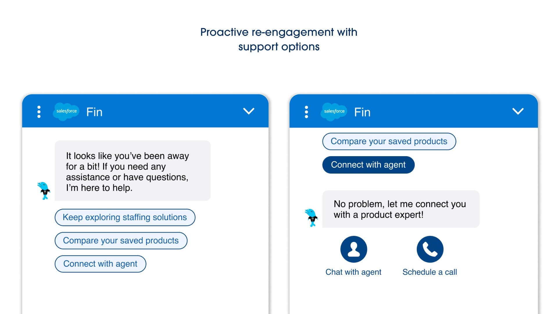
Redesigned the handoff itself: a sales agent became something a buyer opted into, not something they were defaulted to
Sustained engagement on a specific topic — not general browsing — triggered a popup offering to connect with a sales agent, with quick actions to call or copy the sales number directly. The user chose the next step; it was no longer chosen for them.
Transparency cut browsing effort by 40%+ in testing — and the redesigned reply system also drove higher engagement, retention, and satisfaction than the long-text version it replaced.
In iterative prototype testing, the transparency-first design was associated with a 40%+ reduction in browsing effort and reduced user hesitation around AI responses, alongside higher engagement, better information retention, and higher satisfaction scores than the original long-form answers. This is a user-testing result — the project was academic and was not deployed to production.
Next time, I'd design the container the chat lives in, not just the conversation inside it — and go further into the conversational layer itself.
We knew the small chat window was a real constraint, but stayed within Salesforce's existing bounds rather than questioning the size, position, and micro-interactions of the container itself — that's what I'd push on next. I'd also go deeper into the conversational AI layer: we deliberately scoped to data representation and timing rather than underlying model behavior, which was the right call given how fast that space was changing week to week, but it's real depth we left on the table. Studying a moving target like this meant running comparisons through multiple AI persona profiles with tunable conditions — verbose, warm, friendly vs. not — just to keep what we were testing consistent.
Where this leaves things
“The thread that ran through it: trust in AI products isn't a sentiment to manage, it's a design surface — position, transparency, and micro-interactions, not just the words in the reply.”