Aug – Dec 2025 · Interaction Design (academic project)
Reducing cognitive load for older adults with early dementia, with 30% fewer choices
UX DesignInformation ArchitectureAccessibility
What I'm proud of
I design for recognition over recall, so the interface does the hard work.
- Context
The Windows Start menu is a wall of app icons and names: hard to scan, harder to remember.
- Insight
People remember what they want to do long after they forget what the app is called.
- Result
An action-first Start menu with 30% fewer options on screen.
What we delivered
A Start menu that shows you what you can do.
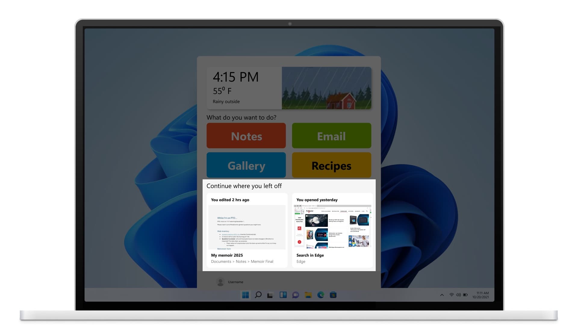
Customizable actions instead of app names
Write, Email, Videos, Photos. Picking one shows only the tools and files for it.
Continue where you left off
Previews of recent work, a pattern borrowed from Word and Excel.
A way back from every step
A back button and error recovery on every path, added after testing.
How I got there
People wanted a simple computer that could still do real work.
Market research, time in a dementia-friendly community, primary interviews, and stakeholder interviews pointed the same way: simple systems that are still capable of complex tasks, so older adults with dementia feel empowered to keep working without feeling confused.
What the research found
Needing help feels like losing independence, so users hide their struggles
Too many choices overwhelm, and app and file names are hard to recall
Users fear breaking the computer with one wrong click
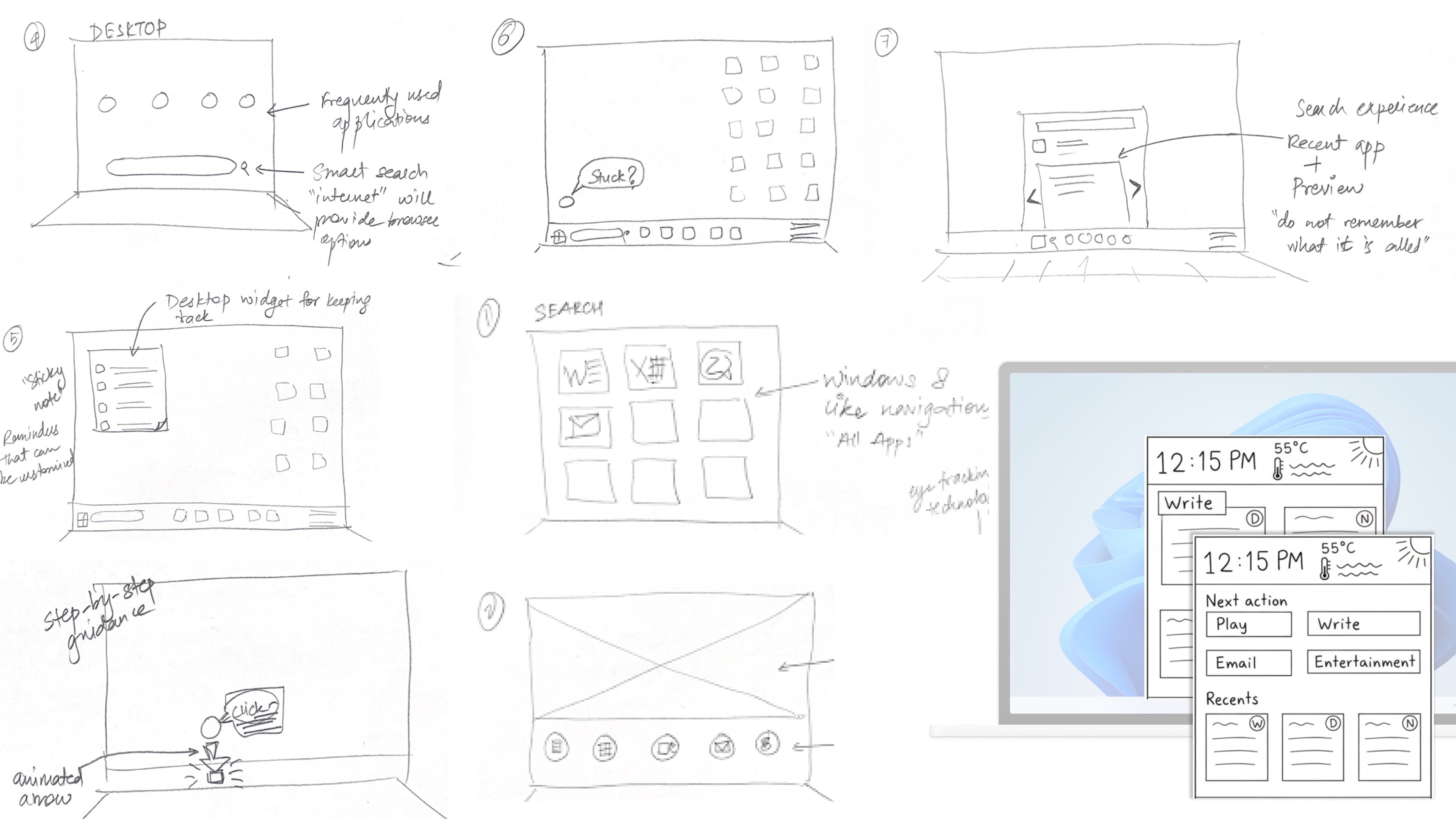
We started with eight ideas each, on paper.
In a Crazy 8s session (eight sketches in eight minutes), the team explored bigger icons, a simple/regular mode switch, a voice assistant that highlights the next click, and a dashboard of family photos. We dropped a Windows 8-style tile menu: Microsoft had moved away from it, and we had no evidence to reverse that.
Key decision
We decided against a voice or chat assistant.
Our first concept included a help assistant. Round one of testing confirmed what the research suggested: asking for help is uncomfortable for these users, because needing help feels like losing independence. So we took the assistant out and made the interface itself show the next step.
First-round concept: the help assistant that testing ruled out.
Our rule: show the options instead of making people remember them.
We used the usability heuristic of recognition over recall: people should recognize options, not have to remember them. For someone whose cognitive abilities are starting to slip, recall is the step that fails first, and app names fail that test: they're proper nouns, they change, and they're among the first things memory loss takes. It helps anyone tired or distracted, too. And the more choices on screen, the longer each decision takes (Hick's law). So we designed to cut both.
Option count, side by side: the standard Start menu vs. the new mode, with the 30% reduction made visible.
Key decision
The menu offers a few actions to start, not every app at once.
The menu opens with a short list of actions: Write, Email, Videos, Photos. Choosing Write filters to Word, Notepad, and the memoir edited two hours ago. That's progressive disclosure: one decision at a time instead of forty. "Watch videos" groups YouTube, Gallery video, and Photos under one label that says what they do.
After choosing 'Write': only the relevant tools and files, with a clear 'Back to all actions'.
Key decision
We added a click on purpose.
Users with dementia worry that touching the wrong thing will break something. So we deliberately added a step. Write shows two ways to write. Choosing Word first shows a preview underneath: a new file, and previews of older ones. In standard Windows, a wrong click opens the app, and getting back means navigating all the way to the Start menu and starting over. The extra step reduces misclicks and the fear of breaking something. It isn't the best fit for every user in every context, which is exactly why this is a mode you switch on.
Key decision
We reused a pattern people already know from Word and Excel.
Word and Excel already show recent files with notes like "You edited 2 hrs ago." We brought that pattern to the operating system as "Continue where you left off", a memory aid that helps users resume instead of restart. Users expect a product to work like the ones they already use (Jakob's law), it means less to build, and it stays inside Microsoft's own design system.
Testing changed the design twice.
We ran hallway tests, then concept tests with older adults, a care partner, and two dementia experts. Round one removed the help assistant. Round two exposed gaps in the spec: who sets the action items, where they come from, and how they're ordered.
What testing taught us
Add a back button and error recovery, so every path has a way out
Make action items bigger, and keep Recents short so it doesn't overwhelm
Sort items alphabetically, so users find things without thinking
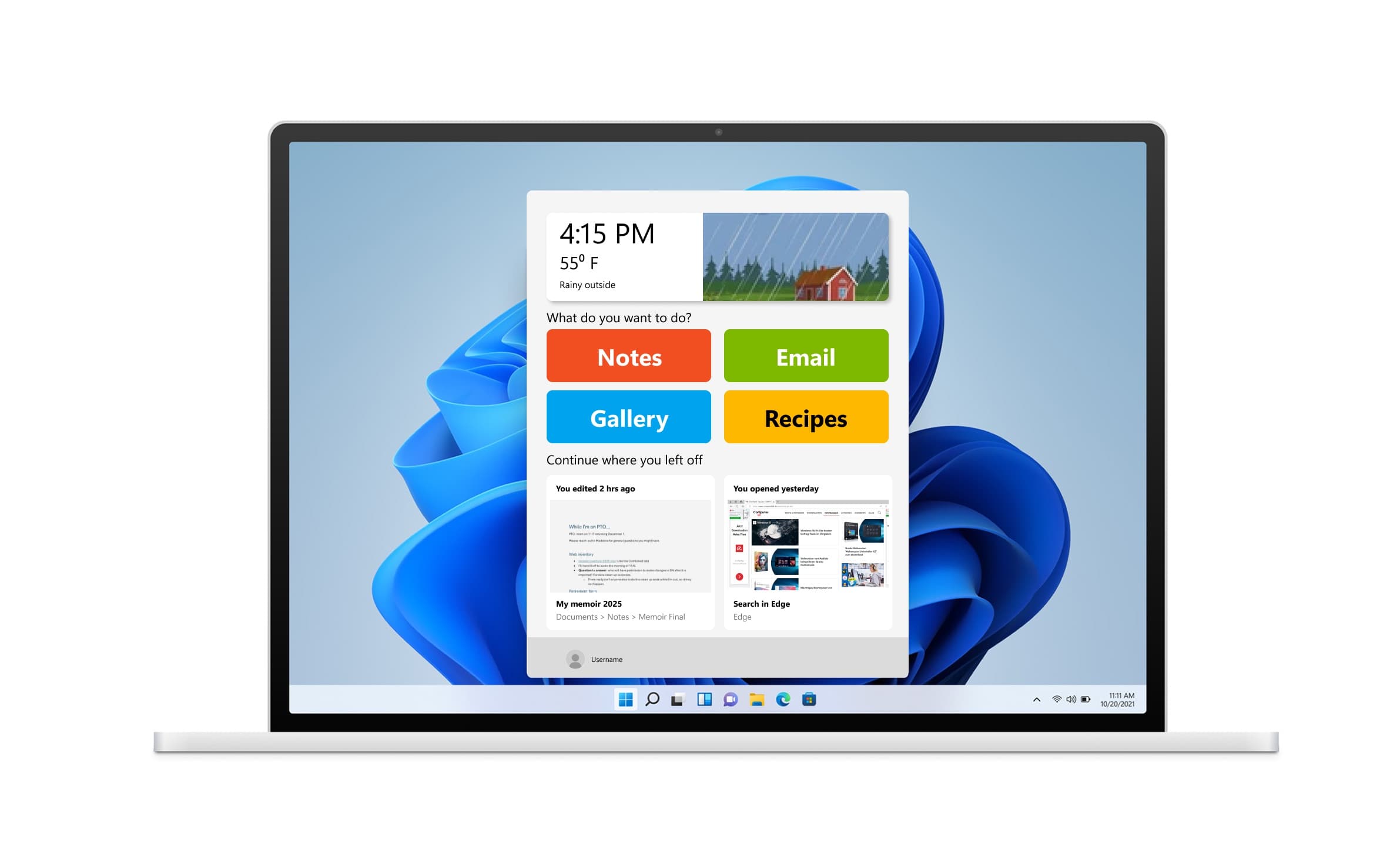
Before/after: the round-two changes (ordering, back button, sizing) side by side.
Showing less turned out to be the feature.
The new mode shows 30% fewer options, and two of the three participants said they would use it because it made using the computer easier. One participant and her care partner both valued hiding the apps she never used. These are usability-testing results from an academic project, not a shipped product.