Start Lite: Windows 11 for Cognitive Accessibility
Reduced cognitive load by 30% in user testing by redesigning the Windows 11 Start Menu for older adults with dementia — ranked #1 by Microsoft's PM and engineering judges.
- Role
- Product Manager
- Timeframe
- Academic project · Microsoft-sponsored · Team of 4
- Focus
- Accessibility · 0-to-1 · Roadmapping
Elderly users were already choosing Chromebooks over Windows — before we redesigned anything, we needed to know why.
A university project sponsored by Microsoft, tackling cognitive accessibility in Windows 11. I worked in the PM role on a team of 4 — one engineer, one sales/marketing lead, and two PMs — responsible for prioritization, backlog creation, and roadmap decisions alongside the design work. Market research showed Chromebooks and Macs were already more popular with older adults and people with dementia, largely for their simplicity and how easily a Chromebook could be pared down to just what a person needed.
The real barrier wasn't the disease — it was a menu that assumed everyone could hold the same number of options in mind.
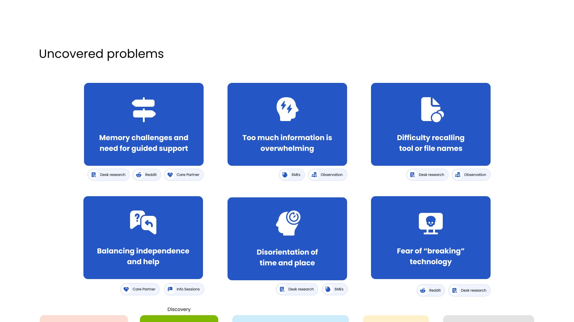
Older adults with early-stage dementia face navigation barriers and cognitive overload in the standard Windows 11 Start Menu — too many on-screen choices, with no way to simplify the interface to what a person actually uses. Reddit research across hundreds of threads, most written by care partners rather than users themselves, showed how people were already coping: adding their few needed tools directly into Chrome as an improvised menu, losing track of time or even day versus night while engrossed, taping handwritten instructions to the machine as makeshift manuals, and abandoning tasks after a wrong click in menus too complex to recover from. Interviews with dementia subject-matter experts added a harder constraint: the longer someone had lived with the disease, the fewer new pathways they could realistically learn — so design impact had a real boundary, not just a direction. Since dementia isn't formally staged into low/medium/high, we scoped deliberately to early-stage — new diagnosis, few signs — rather than design for the widest range and risk helping no one well.
Academic timeline, evaluated by a panel of Microsoft PM and engineering judges
Simplicity had to win over features — competitive analysis showed simplified tablets like GrandPad succeeded with this group precisely because its users weren't power users; the solution also had to be software-only, integrating into the existing Windows ecosystem rather than new hardware
We built the redesign on interviews with the people who'd use it, not assumptions about them.
I sat in on a local elderly-care community's weekly meetings — not just to observe, but to find the discomfort research alone wouldn't surface
Uncovered usability gaps through social media research, longitudinal observation, and direct interviews with older adults with dementia, plus weeks spent as an observer in a local elderly-care community's meetings. That immersion surfaced the project's biggest insight: needing help felt like a burden to admit, a visible sign of losing independence. Design that led with 'ask for help' would be rejected before anyone even tried it.
Mapped the full journey from password to launch, and chose to fix the one step actually worth fixing
Traced the journey from login through to actually opening the tool someone wanted. The password step already had a workaround people had invented themselves (sticky notes) and wasn't worth redesigning; the Start Menu — the highest-impact, highest-frequency point of confusion — became the target.
Chose actions over app names, and borrowed a pattern Microsoft had already validated elsewhere
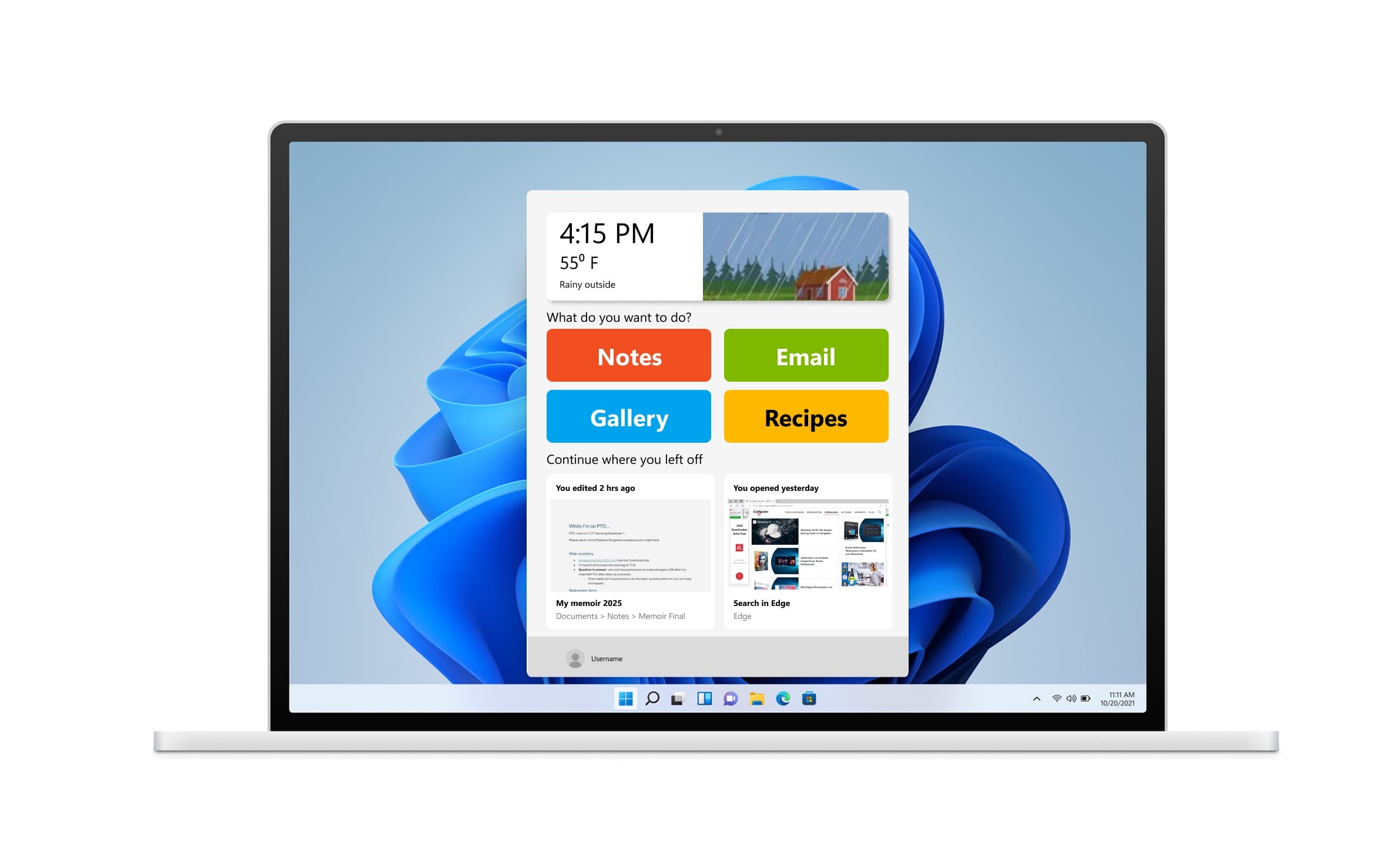
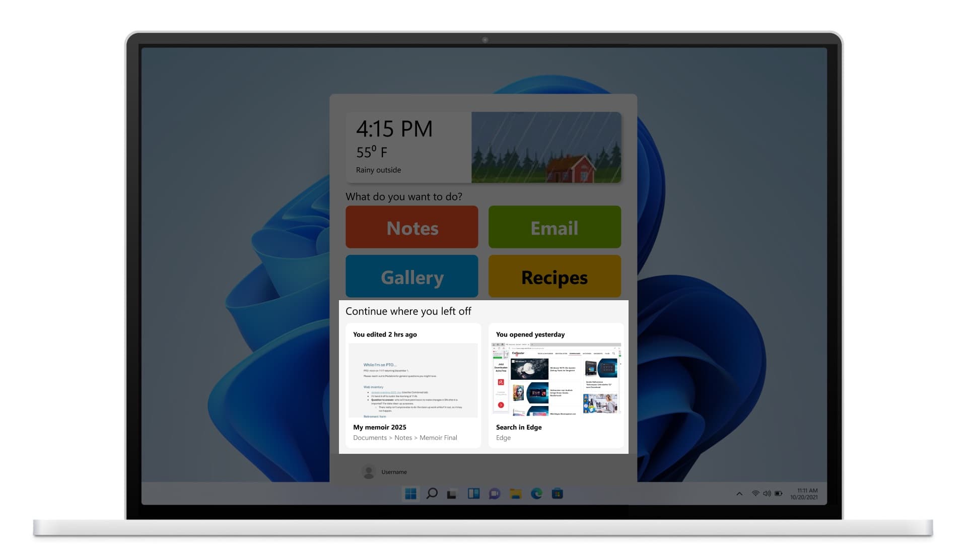
Led backlog creation and roadmap decisions for the team, cutting on-screen choices rather than adding features. Since proper nouns like app names are easier to forget and change more often than actions, tools were grouped under customizable 'Action' items instead — 'watch videos' surfaced YouTube, the Gallery filtered to video, and the Photos app together, so the label reminded a user what a tool actually did, not just what it was called. We adopted a pattern already used in Word and Excel — thumbnail previews with a short context snippet of when a file was last touched — into the Start Menu, and moved time and weather into a large, prominent widget instead of the small taskbar corner it usually occupies.
Considered a chatbot, then rejected it — asking for help was exactly what the research said to avoid
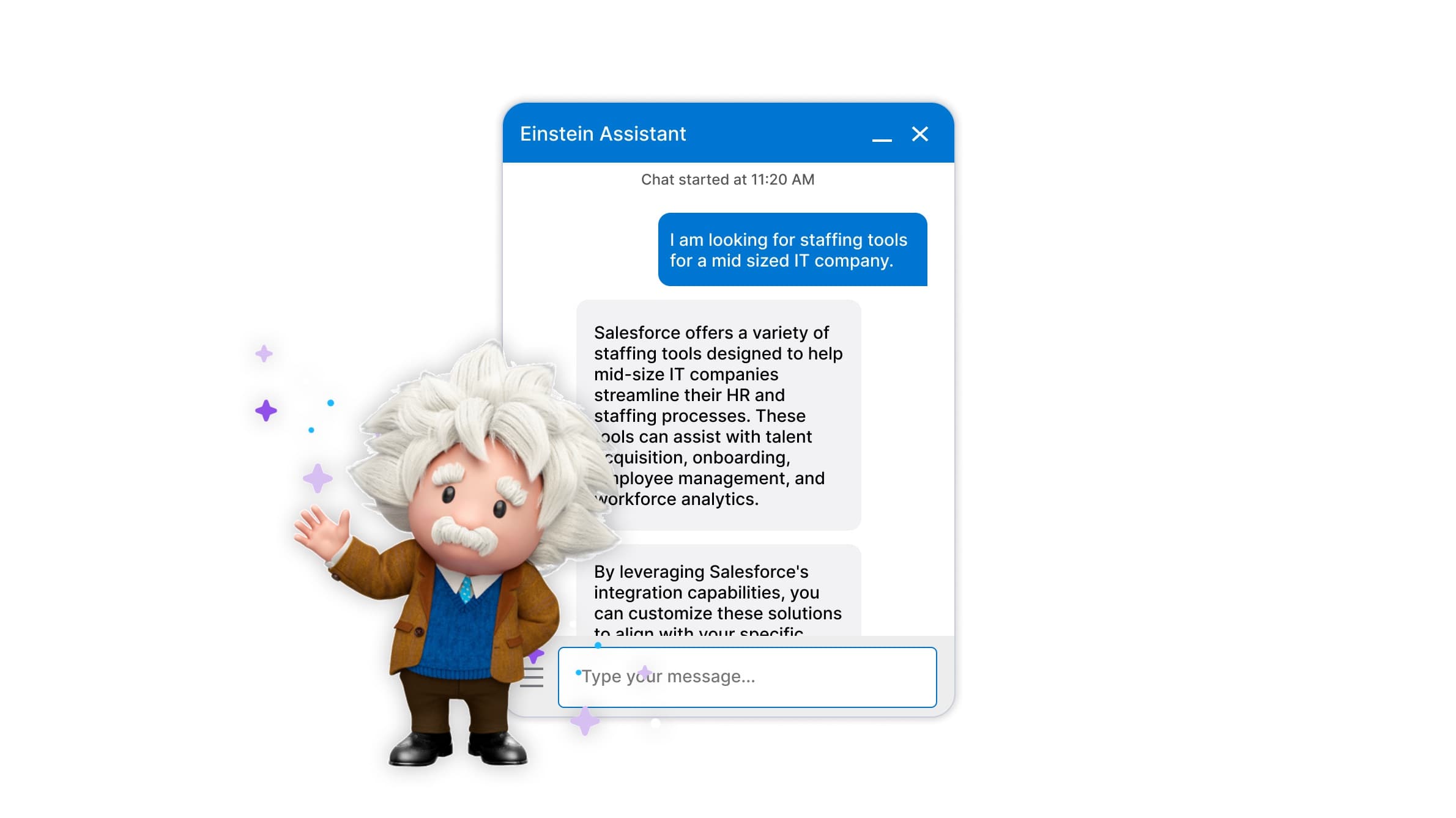
We explored interactive help options early, then dropped them: prompting for help ran directly against the independence-preserving insight from the community research. We also left a Windows 8-style menu one teammate sketched off the table — Microsoft had already moved deliberately away from it in Windows 10, and we didn't have grounds to reverse that call. Simplification won over adding any new feature.
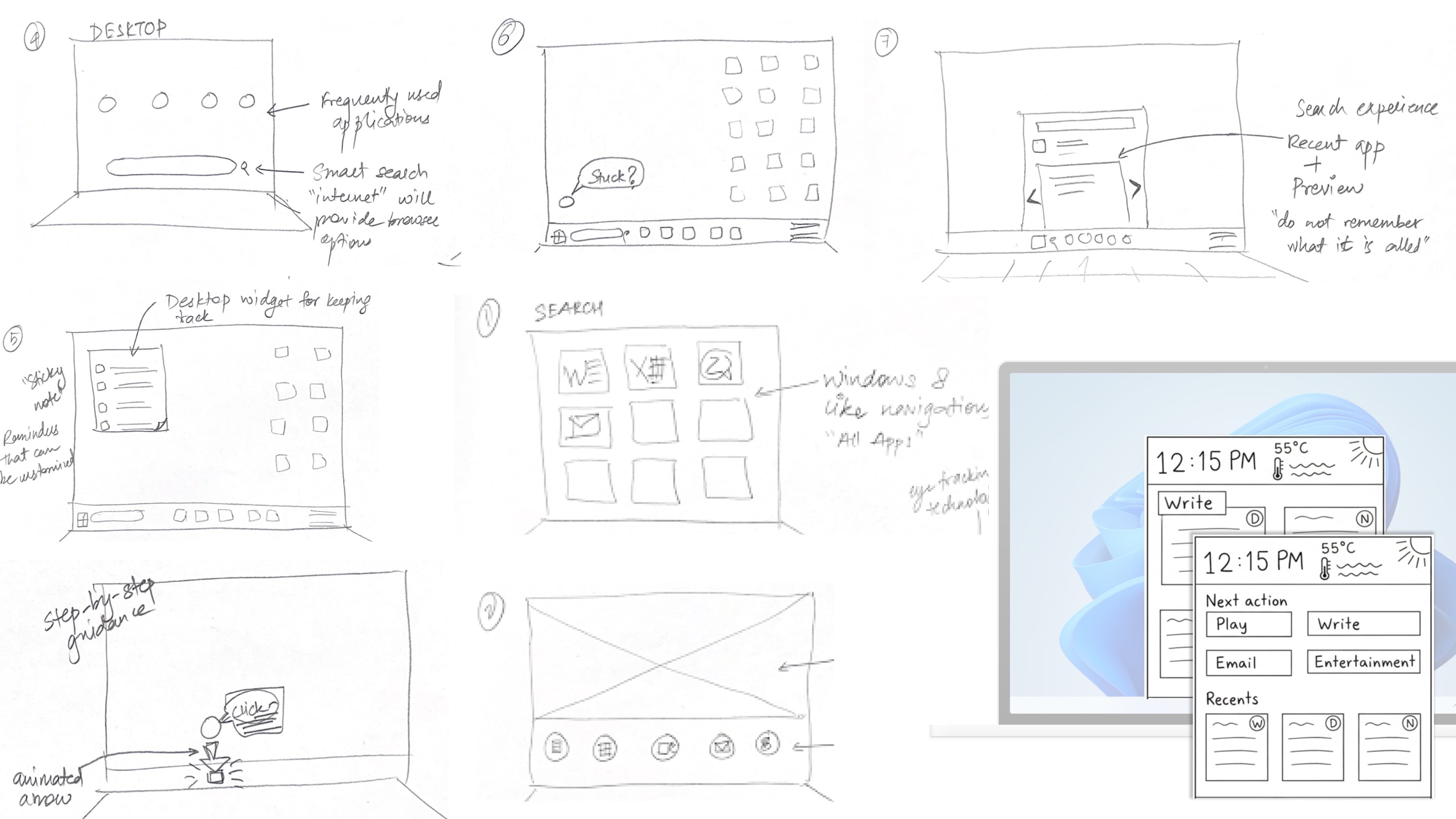
30% less cognitive load in testing, and the top score from Microsoft's own judges.
In user testing, the redesign reduced cognitive load by 30% and achieved a 65%+ satisfaction score. The project was ranked #1 by Microsoft's PM and engineering judges. Testing also surfaced clear next steps: people responded well overall, but wanted the Action items themselves put in some order, with clearer familiarity cues for the tools grouped inside them. These are user-testing results — the project was academic and was not deployed to production.
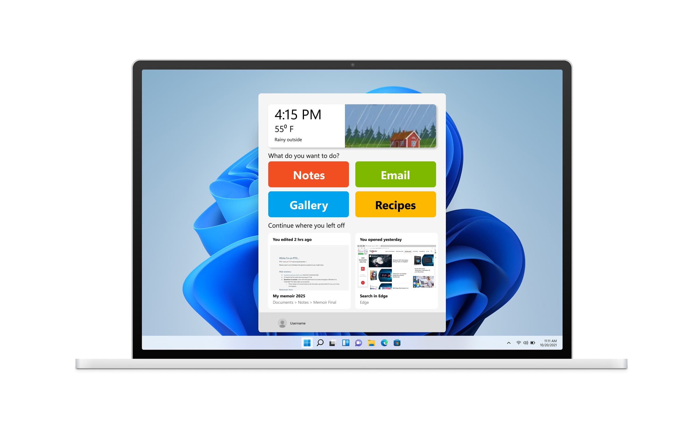
Next time, I'd go further than the Start Menu — and bring care partners into the process, too.
We scoped to a small entry point — just the Start Menu — partly for time, and partly because the Start Menu touches nearly every team at Microsoft; going further would mean real cross-team collaboration and reusing components that weren't fully ours to redesign alone. That constraint shaped the roadmap: care-partner and customization interfaces were queued up for a next version rather than built. I'd iterate further on customization, going deeper into how different users actually approach setting up their own experience. I'd also test more directly with care partners to understand their side of the workflow: setting up an elderly relative's profile, doing initial setup, and what guides or support would make that easier.
Where this leaves things
“The principle held across the project: accessibility isn't a feature you add, it's what's left when you strip an interface down to what a person can actually hold in mind.”